Table of Contents
NeuroElf - GLM beta plotter
Motivation
This tool is mostly meant as a quick visualization for the assessment of whether or not a statistical test value (t-contrast) found in a specific part of the brain “makes sense” w.r.t. the hypothesis of the study, and in part also to identify outlier subjects.
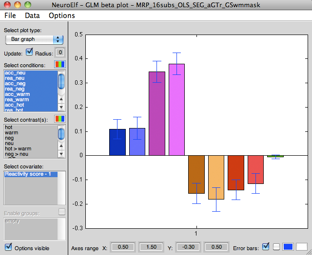
For instance, if the design contains two sets of stimuli (images and temperatures, an example taken from my lab), and within each set there are sub-categories (negative vs. neutral, and a reactive vs. accepting mindset), a contrast between negative and neutral images might show a strong activation cluster (in the example image below in visual cortex). Still, this contrast might be driven by a variety of differences in processing, and to confirm that, indeed, the term in the contrast that “makes the difference” a bar plot can be used to visualize the actual means (and also individual subjects' values), which then gives more confidence in that the result is not a stray finding.
Requirements
A RFX-GLM file must be loaded and selected as the currently used statistics object, which will then enable the user to use the GLM menu.
Opening the UI
To open the UI, select the Beta/scatter plotter entry from the GLM menu.
GUI layout
When initially opening the beta plotter, the bar graph option will be selected (watch the video on the GLM beta plotter on the right, or go to the full resolution page):
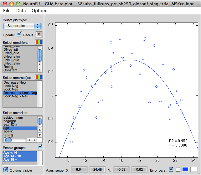
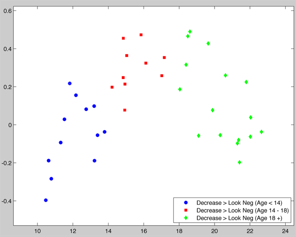
The following screenshot shows a different dataset, where a covariate (age) was scattered against a contrast, and a quadratic fit was computed:
Controls
The following controls are available:
- Plot type (dropdown) with settings Bar graph, Scatter plot
- when Bar graph is selected, the average (and optional individual) beta or contrast values will be shown as bars (and on-top-of-bar scatter points), with optional error bars, subject labels (if points are plotted) and trend lines (if more than one bar per group is shown)
- when Scatter plot is selected (only available when a covariate is configured and selected as well), the beta or contrast values of the first selected predictor/contrast will be scattered (Y axis) against the selected covariate (X axis)
- Update (checkbox): if checked, the plot updates with the cursor position and also when a cluster is selected from the list of VOIs
- Radius (edit field): when the brain is browsed with the Update box checked, this determines the sampling size for the displayed betas (default being 0, meaning that only one voxel worth of data is shown)
- Select conditions (multi-selection listbox): for Plot type Bar graph, all selected conditions will be shown, for Plot type Scatter plot only the first condition will be shown; conditions and contrasts cannot be selected at the same time, so selecting a condition forces all contrasts to be de-selected
- Condition color settings (button): this button allows to re-set the colors for each condition (as they are stored in the GLM file) for visualization purposes; it also allows to re-define colors for contrasts (as opposed to the sum of their condition terms)
- Select contrasts (multi-selection listbox): same as conditions, selecting one or more contrasts de-selects all conditions
- Contrast color settings (button): same as condition colors
- Select covariate (single-selection listbox): only used when Plot type is set to the Scatter plot option, in which case the selected covariate is used as the independent variable (X axis) for scattering and regressing the beta/contrast values
- Enable groups (checkbox): if groups are configured in the GLM file (see Contrast manager UI), bar graphs and scatters will be shown for each group separately
- Groups (multi-selection listbox): if groups are enabled (checkbox ticked), bars and scatters of (mean) beta/contrast values will be shown for each group separately
- Options visible (checkbox): if unchecked, all other controls are hidden and the axes is maximized to cover (almost) the entire figure (improved screenshots)
- Axes range X/Y from/to (edit fields): if the auto-scaling of the axes object is undesirable (e.g. to use the same scaling across several regions/studies/etc.), the
XLimandYLimaxes properties can be set via these four edit controls; to revert to auto-scaling, simply enter an invalid number (e.g. any letter) - Error bars (checkbox): if checked (default) and Plot type is set to Bar graph, error (SE) indicators are shown around the mean value each bar represents (SE of mean); if individual data points are plotted (see next control), the error indicators represent standard deviation (SD)!
- Individual points plot (checkbox, unlabeled): if checked and Plot type is set to Bar graph, individual datapoints (one for each subject and selected condition/contrast) is scattered on top of the average bars; in that case any error indicators represent standard deviation instead of SE!
- Error indicator color setting (button): this button can be used to alter the color of the error indicators
- Background color setting (button): this button can be used to alter the background color of the axes
Menu
The following functions are available via a menu:
- File
- Save figure screenshot… - calls the private screenshot function of NeuroElf, requesting a filename, saving the figure as an image
- Save axes screenshot… - calls the private screenshot function of NeuroElf, requesting a filename, saving the axes object as an image
- Save full axes screenshot… - hides the options (incl. the Options visible checkbox!), then calls the screenshot function for the figure
- Data
- Set Data in Base Workspace - make the data currently used available in the base workspace
- Copy plot to separate figure - copies the plot with its current configuration into a separate figure (which is useful for annotations, etc.)
- Options
- Legend settings - sub-menu with items
- Legend for bars - if selected (and subsequently being “checked”) a legend axes object is shown when the type option is set to Bar graph, giving the names of the predictors/contrasts in their colors
- Legend for scatters - if selected (and subsequently being “checked”) a legend axes object is shown when the type option is set to Scatter plot, giving the name of the predictor/contrast and, for multiple groups, the group name
- Legend position - a sub-section with entries Northwest (default), Northeast, Southwest, and Southeast determining the location of the legend sub-axes object (according to Matlab's standard)
- Remove zero (0) values - if selected (and subsequently being “checked”) all subjects which have a zero (0) value in their mean (in all conditions for bar plots or in either the predictor/contrast or the covariate in the scatter plot) will be deselected regardless of their selection/group status
- Robust stats - if selected (and subsequently being “checked”) all statistical procedures (mean for bar graphs and fitting for scatter plots) are done robustly
- Scatter options - sub-section with entries
- apply groups separately - if selected (and subsequently being “checked”) plot separate scatters for each selected group; furthermore if only one group is selected the color and symbol choice is limited to that group, allowing to configure multiple colors and symbols for different groups
- best-fit straight line - if selected (and subsequently being “checked”) performs a simple linear regression between the covariate and the DV with two parameters: intercept and linear slope; a line representing the best fit will be plotted on top of the scatter plot (selecting this option forces the quadratic fit to be deselected)
- best-fit quadratic - if selected (and subsequently being “checked”) performs a multiple linear regression between the covariate and the DV with three parameters: intercept, linear slope, and the square of the (mean-removed) covariate; a curve representing the best fit will be plotted on top of the scatter plot (selecting this option forces the straight line fit and the confidence ellipse to be deselected)
- confidence ellipse - if selected (and subsequently being “checked”) also plots a bi-variate confidence ellipse on top of the scatter plot (selecting this option forces the best-fit quadratic option to be deselected)
- set marker type - sub-menu with items for circle ( o ), cross ( x ), plus ( + ), asterisk ( * ), dot ( . ), square (square), and diamond (diamond); the selection will either be applied to all groups (if groups are disabled or multiple groups selected) or the selected single group
- statistics output - if selected (and subsequently being “checked”; this is the default), also prints an estimate of R2 (total amount of variance explained by regression) as well as the related p-value (for inferential testing) next to the scatter plot
- use filled markers - if selected (and subsequently being “checked”) uses filled markers (only for circle, square, and diamond markers); the selection will either be applied to all groups (if groups are disabled or multiple groups selected) or the selected single group
- Subject labels - if selected (and subsequently being “checked”) also print a text label with the subject ID next to each scatter dot (also works for bar graphs if individual datapoints are enabled)
- Subject profile lines - if selected (and subsequently being “checked”) also plot connecting lines between predictor/contrast values across conditions (one line per subject) on top of bar graphs
- Subject selection - brings up a listbox selector (
listdlg) with the subject names, allows to exclude individual subjects from the plotter (e.g. to see if a particular subject is an outlier in all conditions, or otherwise shows an abnormal pattern)


